Navigation
Install the app
How to install the app on iOS
Follow along with the video below to see how to install our site as a web app on your home screen.
Note: This feature may not be available in some browsers.
More options
Style variation
You are using an out of date browser. It may not display this or other websites correctly.
You should upgrade or use an alternative browser.
You should upgrade or use an alternative browser.
Forum 2.0 glitches, change requests etc
- Thread starter Raider
- Start date
- Watchers 8
I think I've got the timestamps fixed. Let me know if you'd prefer a different color.Looking into the stupid timestamps
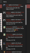
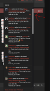
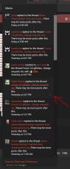
I don't understand the issue here. The dot is filled in when it's unread and empty when it's read. You can toggle between read/unread too. What sort of change are you looking for exactly?Alert colorings need some work for unread/read:
Base: View attachment 33262
Hovering unread:View attachment 33263
Hovering read:View attachment 33264
Enki
Motorhead
You have to hover over each one individually to see what's read and what isn't.I don't understand the issue here. The dot is filled in when it's unread and empty when it's read. You can toggle between read/unread too. What sort of change are you looking for exactly?
Got it. This should be fixed now.You have to hover over each one individually to see what's read and what isn't.
Awafrican
Moderator
motorhead (names) may as well be admin coloured with the red. Firefox mobile, also see how timestamps are under in chat. they don't do that on desktopMotorheads are not mod colored. Chat body count off. Looking into the stupid timestamps
Attachments
That's just because the site is responsive. Turn your phone to the side and the timestamps are not under anymore. There's just no room with a small screen in portrait.see how timestamps are under in chat. they don't do that on desktop
Awafrican
Moderator
i almost never use my phone in portrait it's horrid. is there a way to just disable time stamps if portrait on mobile? or just insert them at the end of the text. I understand this is a different platform worked just fine in the old version and the box was bigger.That's just because the site is responsive. Turn your phone to the side and the timestamps are not under anymore. There's just no room with a small screen in portrait.
Different add-on company. But it's a valid idea.Old site the timestamps were before the chat message, just FYI.
It required some custom CSS, but it should be working. Give it a try.is there a way to just disable time stamps if portrait on mobile?
Awafrican
Moderator
thank you so much! it's working I can toggle to desktop mode if I want time stampsIt required some custom CSS, but it should be working. Give it a try.
Attachments
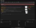
I'll be transferring over some of the customization from the old theme, like making the chat window in the tab a bit bigger. You can also click the settings icon at the top right of the chat and enable maximized mode.Any way the chat tab can be filled out a bit more? This is kind of ass compared to the near full screen the last shout tab had on the old site:
View attachment 33292
The fat ass footer has as much space used as the visible shout area
Similar threads
- Replies
- 5
- Views
- 887
- Replies
- 4
- Views
- 767
- Replies
- 1
- Views
- 598
- Replies
- 4
- Views
- 2K
- Replies
- 6
- Views
- 1K


